We would just like to make clear that this article is not an original by TheCoinRadar. All credit goes to @TheCryptoFam and their Twitter page. Here is the direct link to the thread containing the contents of this article, which we have merely reproduced in an easily-readable format.
This is a wonderful, simply to follow breakdown and we are sharing this because we think everyone needs to read it. Please follow them on Twitter.
And so, without further ado:
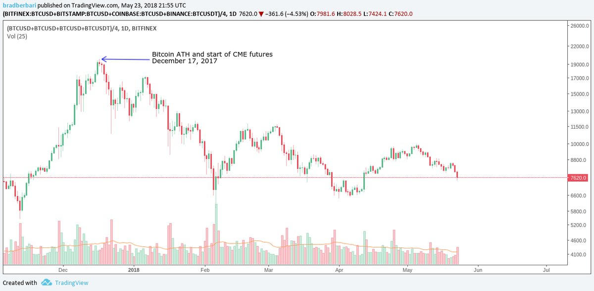
Bitcoin reached its all time high (ATH) on December 17th of 2017, the exact date that CME futures trading began. In retrospect, it is now obvious that smart/institutional money was stocking up before that date. Hindsight is 20/20.

Since 12/17/17, Bitcoin has been in a bear market. The remainder of this analysis will focus on patterns observed during this market downturn, as well as signals for when it might come to an end.
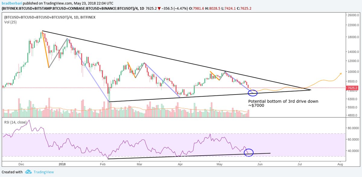
The bear market has consisted of 3 major drives down, represented by black arrows in the chart below. We are currently in the midst of the 3rd drive down, awaiting a bottom. More on that later.
Each of these drives down have followed a very similar pattern. First, you see a fake-out dump (orange lines), then a failed rally (grey lines), then finally the major dump (blue lines).
Within this pattern, there are important details. Each greater leg down is made on lower selling volume, marked by black lines at the bottom of the chart. This chart is a composite of the volume from Binance, Bitfinex, Bitstamp, and Coinbase.
Not only is selling volume lower, but the drops have been less severe. Each component of each leg down is less steep than the previous leg down. RSI, a momentum indicator, also shows selling has been less extreme. The trend is “flattening out”

So what does this mean? In our opinion, the bear trend is running out of gas. Bears/whales/market makers held a great supply of BTC that they pumped until 12/17/17. As they sell BTC and drive price down, their share of the total market supply is decreasing.
This is a very simplified explanation of how markets work. A great deal of the total BTC supply is not traded. Some is lost forever in idle or forgotten wallets. Other Bitcoin is hodled by strong hands who never sell. This gives MMs greater power with their share of BTC
Now we can begin to understand why each leg down is less severe. Because MMs/whales hold less BTC at the start of each leg down, their power to lower the price with market sells is reduced.
All of these signs point to an imminent end to the trend. Bounces are not going as high, while bottoms are not as low. The black lines show this convergence. It is almost time for whales to begin accumulating their BTC again, rather than distributing/taking profits.
Again, this is a simplified explanation of how markets work, but it’s more useful than strictly following fundamentals or news intended to deceive. Hopefully the market patterns make more sense to you now. The chart says we’re almost ready to go up!
Although we do like to include news and other articles of interest, our main focus at TheCoinRadar is on researching and writing comprehensive, independent ICO reviews – to have a look, please head over to our ICO review page.
